Nicer looking linkblog
2023-07-11 18:47:00 +0700 by Mark Smith
When I migrated the website from Heroku there were so many things that needed to be done. It was pretty much a complete site rebuild. At the time my driving thought was to get the basics right, or at least mostly right. With a good foundation I could make things better over time. Some of the big things were:
- jamstack with github workflows
- single domain rather than multiple subdomains
- all content in markdown files rather than json files
- server side components
There were loads of others. When I was laying out the HTML, I wanted the site to use latest HTML5 tags and best practices, and I also wanted the whole site to at least look pretty good with a small amount of inline CSS. I spent ages trying to figure a way to organise <main>, <article>, and <section> tags that made sense. It's not that obvious when you get into the details.
A blog post is an article for sure, but what about a day on the linkblog? What about a single linkbkog link? What about the blog/podcast/newsletter listing pages, is each entry an article? And what about the latest page, should I even bother with article tags there, maybe just use regular unnordered lists? Should I nest articles?
So many small details that can actually make a lot of difference. Initially I went a bit overboard on unnordered lists. I had <ul>’s basically everywhere. Lists of blog posts, lists of links, lists of everything. The nice thing about lists is you get a small amount of visual structure and spacing for free, especially if you sprinkle some <p> tags in the right places. I figured I could style the lists later with CSS to make everything look better.
I don't know that I've gotten it right or even mostly right yet, though it feels like I'm making progress.
Anyway one place that's been bugging me was the main linkblog page. I initially went with a list of lists approach. A list of days, with each day containing a list of links. It worked reasonably well, though the bullets change on each indentation level. Level 1 has normal looking bullets, circular whole black dots. But level 2 they are hollow, with the center of the black dots removed. They look wierd. The indentation also looks kind of bad on mobile devices, because you waste a lot of the valuable screen real estate on the left side of the screen.
Here's what it looked like:
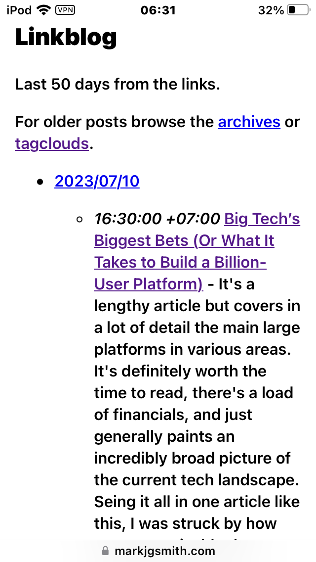
I've been trying to style the lists for a while now. I never got it looking good. The styles weren't applying the way I wanted. I would style the outer list, and the inner list would also get styled, or the opposite way around, even though I was targetting different class names. Lots of finicketty stuff like that. I gave up eventually, figured it was good enough, I had more important things to worry about and get right.
Anyhow it occurred to me yesterday to just ditch the outer list. Instead just have a load of <articles> items on the page, each one still containing a list of links. I wonderred what the default spacing would look like. Well it was a quick change to remove the outer list, tried it last night, and it worked wonderfully.
Here's the updated linkblog page:
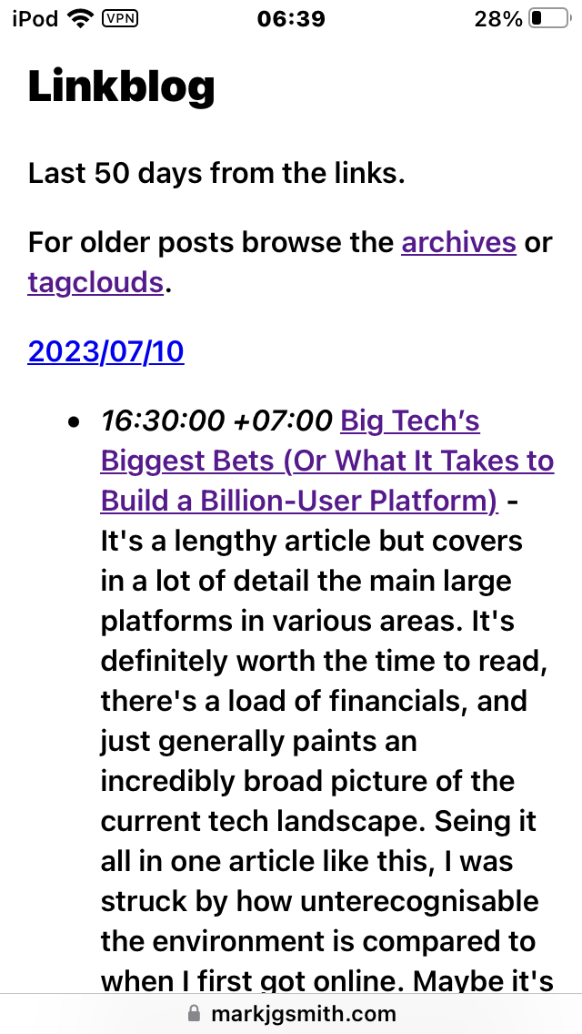
Ok so yeah it looks like a very minimal change, but I think that looks way better. I still get the structure, spacing and indentation of the bulletted lists for the links, but less wasted space and only one type of bullet point. I know the whole site is still too minimalist, but broadly speaking it's way easier to read, with the day dates snug on the left. It definitely is way easier to read on mobile, and these days that's how most people read the web. #