Revisiting Instapaper for offline reading
2023-06-29 07:12:00 +0700 by Mark Smith
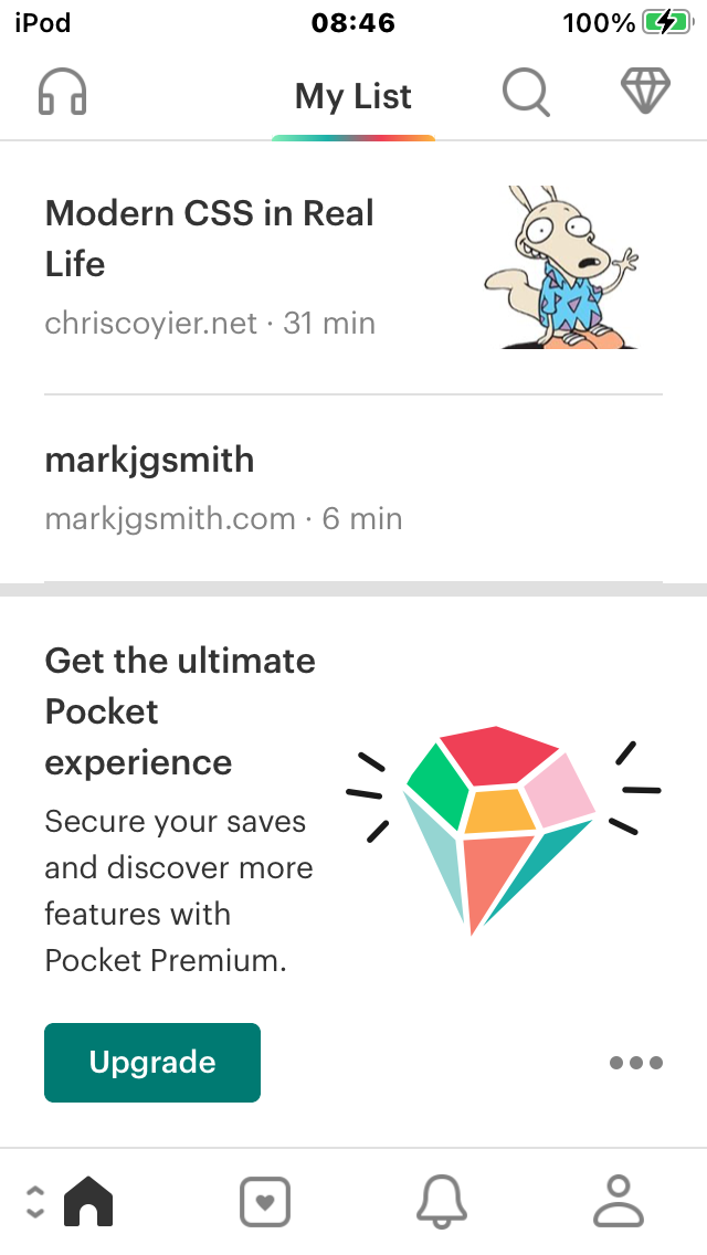
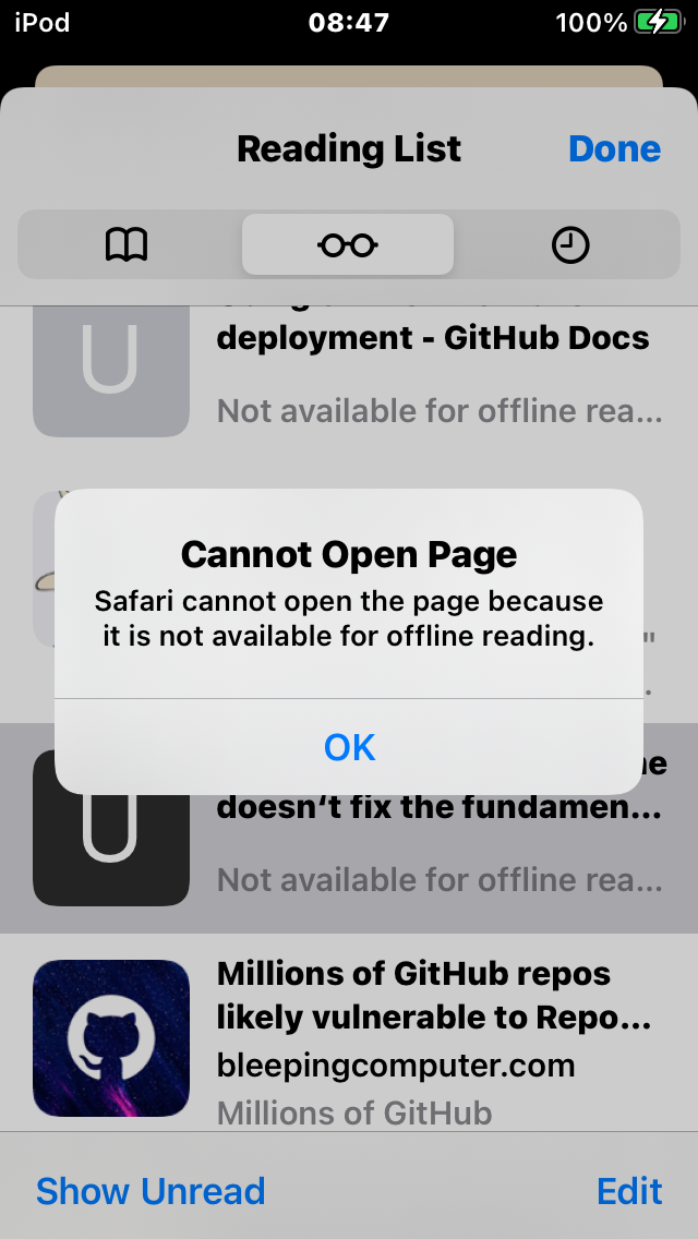
Following on from Monday's piece about the issues reading web development content offline with Safari Reading Lists and Pocket, I wondered again about Instapaper. I had previously tried it but gave up after getting frustrated with the experience. There was a lot going on last time I tried it. I was having to jump around between apps, and was also in a bit of a rush. It's easy to get lost in a sea of features sometimes. Was the overall app experience really as bad as I remembered?
I re-opened the app to have another look. The default screen on opening the app is the saved article list. The first thing I noticed was that it just sort of looks a bit classier than Pocket's listing page. The title font and the layout of each item results in a vaguely newspaperish vibe. The content just seems to fit the available space a bit better. There are both titles and descriptions and less white space around the thumbnails. The article titles all seemed to be correct too. When an item does get saved, it looks kind of nice. I decided to give Instapaper another try.
Let’s look at the same screenshots:
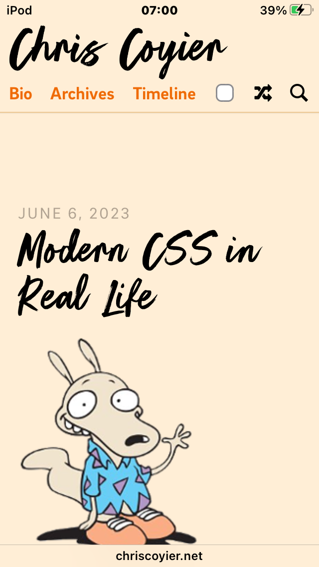
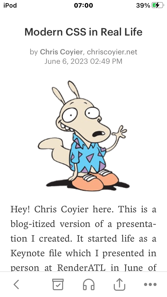
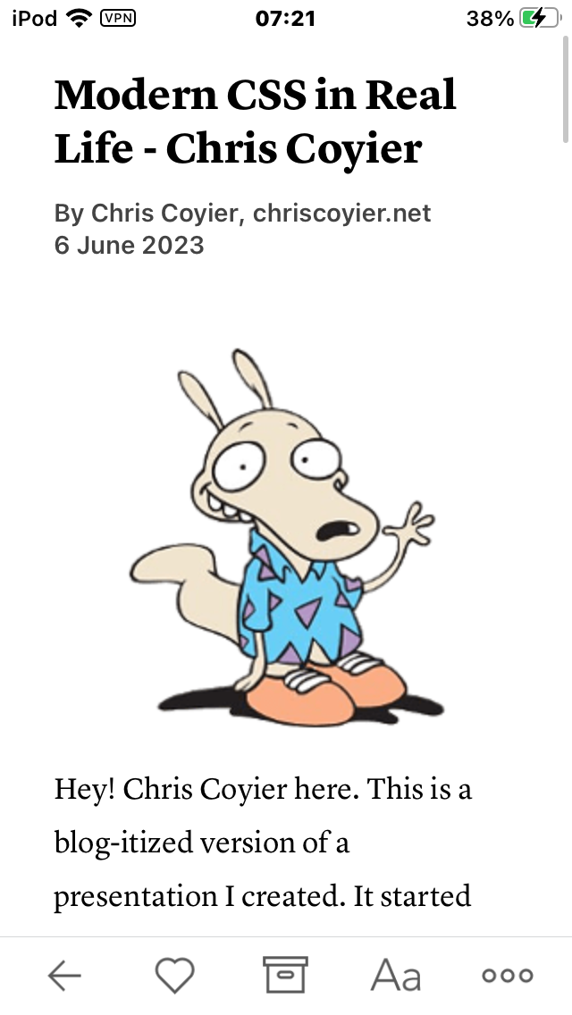
As with the Pocket, the article saved in Instapaper has most of the page styling removed. It looks much the same as Pocket’s version. The site’s style is lost but the page is still readable. I guess some folks like the consistency. Personally I prefer being able to see the original website styling.


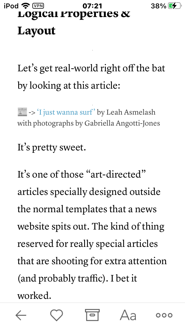
As with Pocket, the article saved in Instapaper is missing images. In fact it’s a bit worse because literally all the images are missing. It’s already game over as far as learning CSS. There’s not much point continuing to read the article. But let’s continue for the sake of comparison.
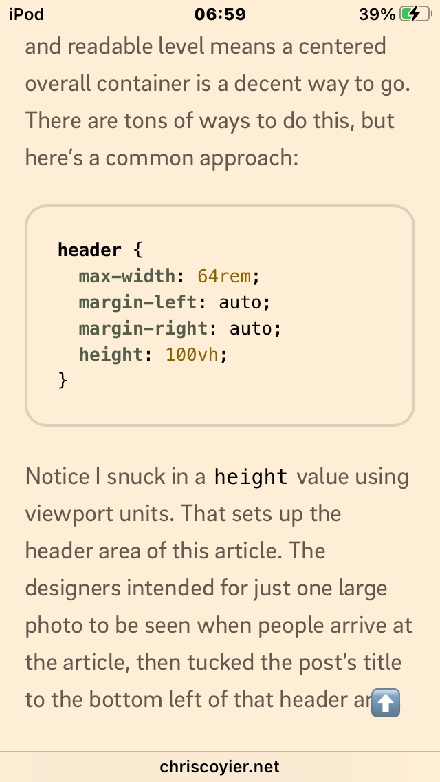
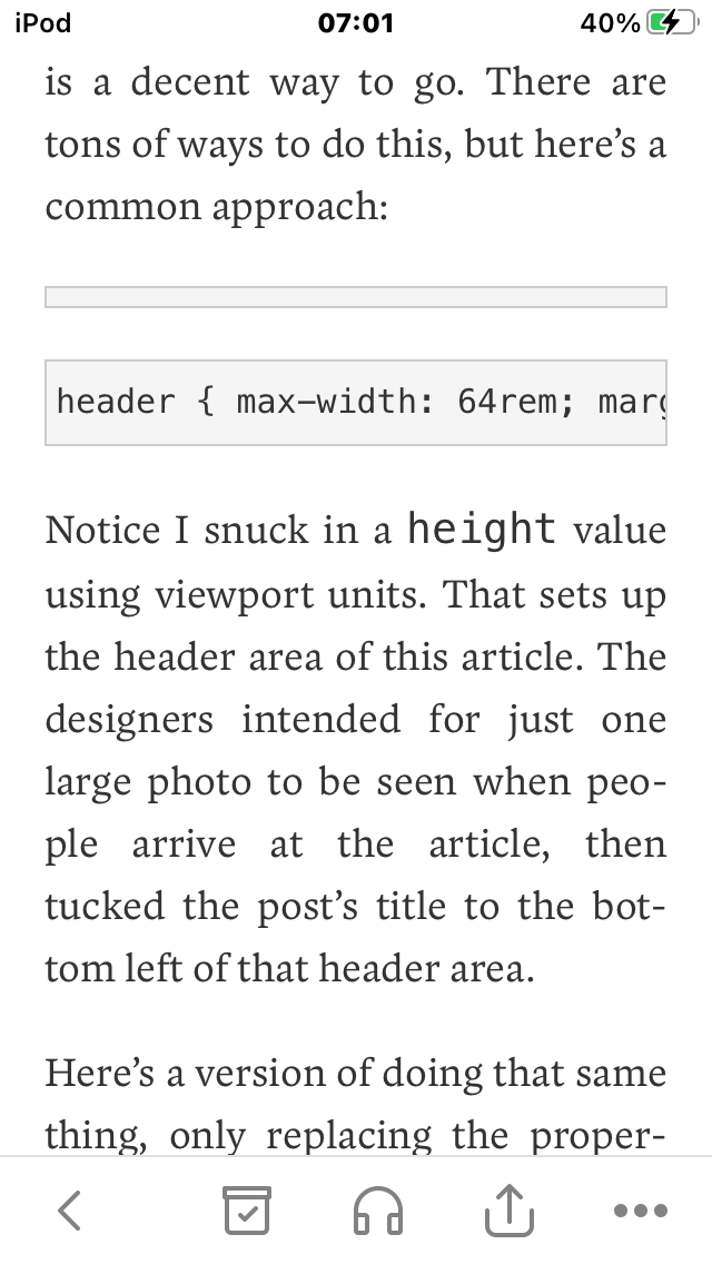
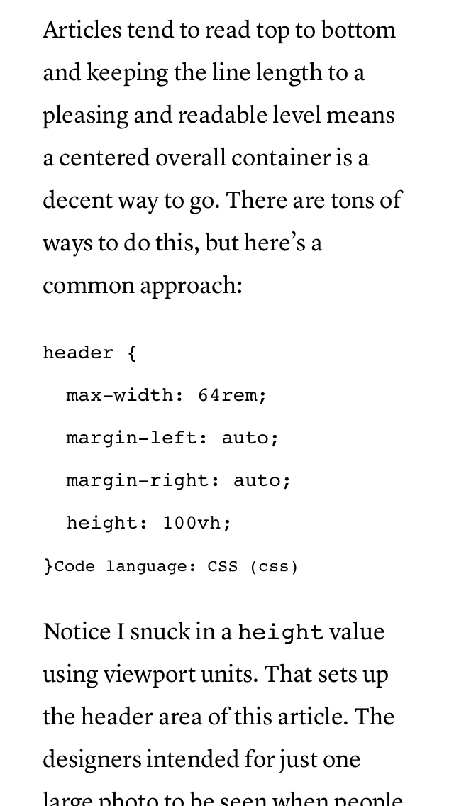
Code snippets are looking better than in Pocket. At least the newlines haven’t been removed, but syntax highlighting has, and that has exposed the style hint meant only to inform the syntax highlighter what language is being used (CSS in this case). Readable but looks kind of ugly. An entire article full of these would be a real slog to get through. Syntax highlighting really makes a big difference when trying to comprehend code.
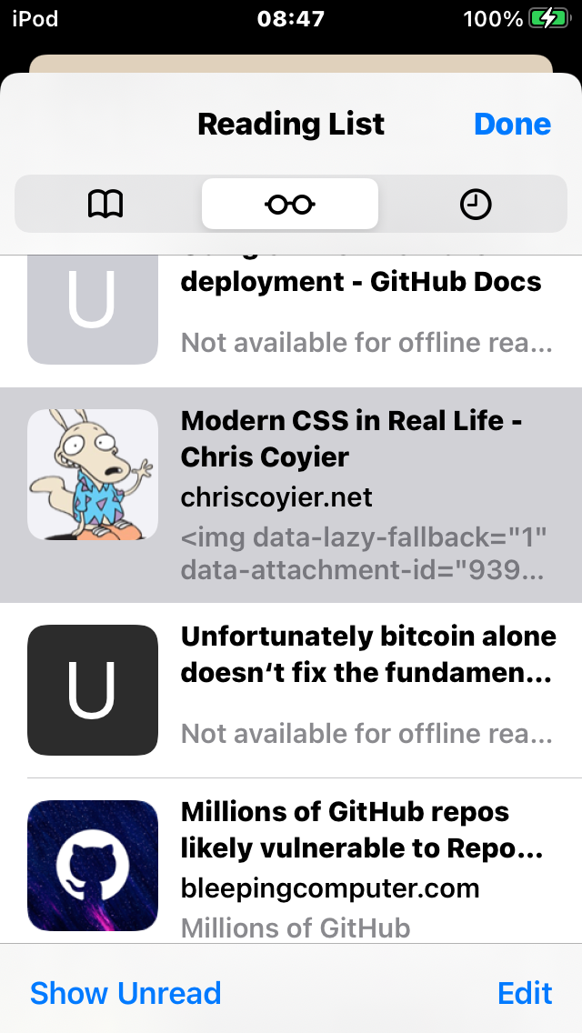
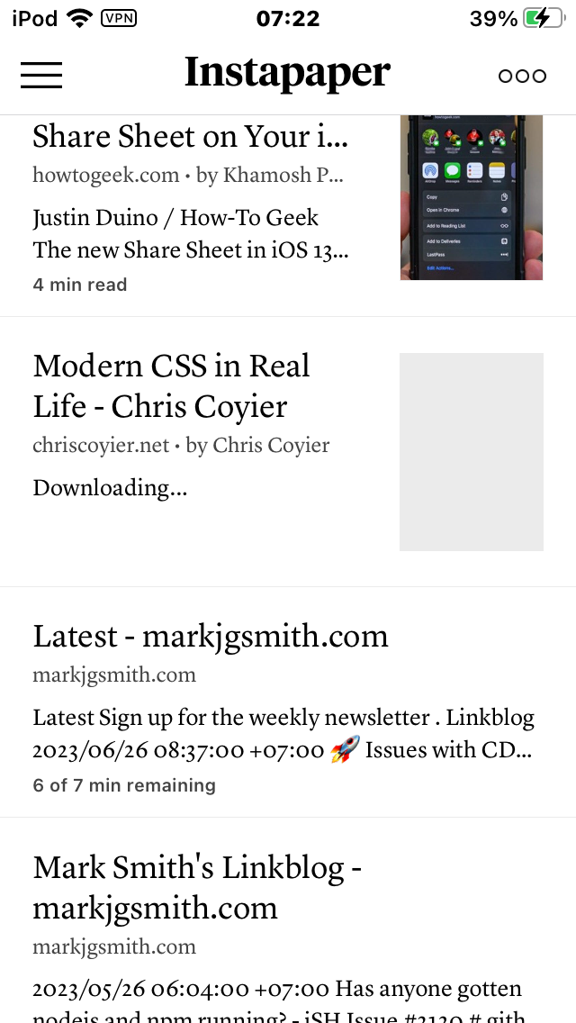
The listing page for Instapaper looks pretty good, though notice it’s still “downloading”. That never completed by the way, nice though it is to have a progress indicator. I don’t have a screenshot of my Bitcoin article, but the title did get correctly saved. So it seems Instapaper has the better webpage parser, or at least it works better with my website.
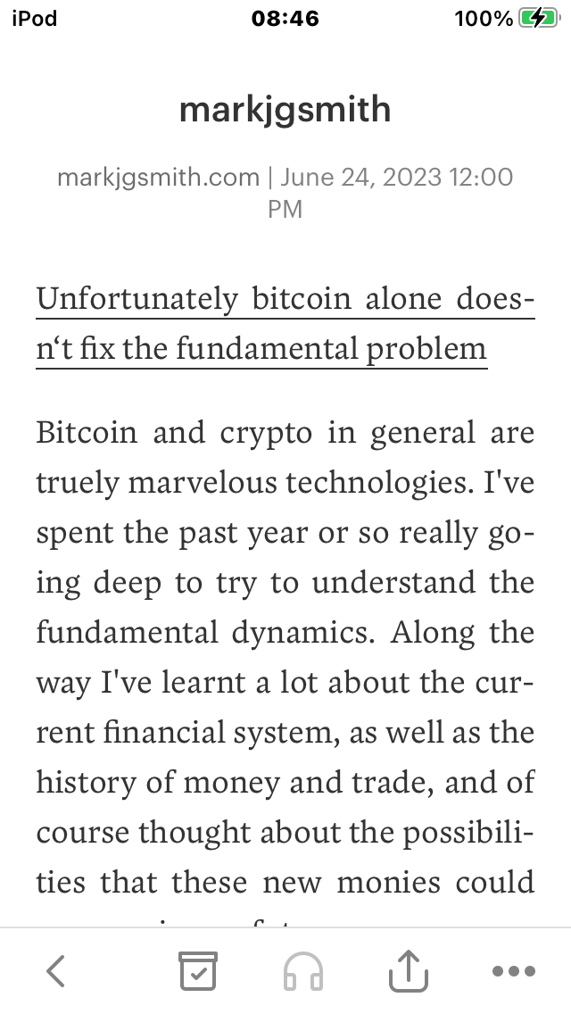
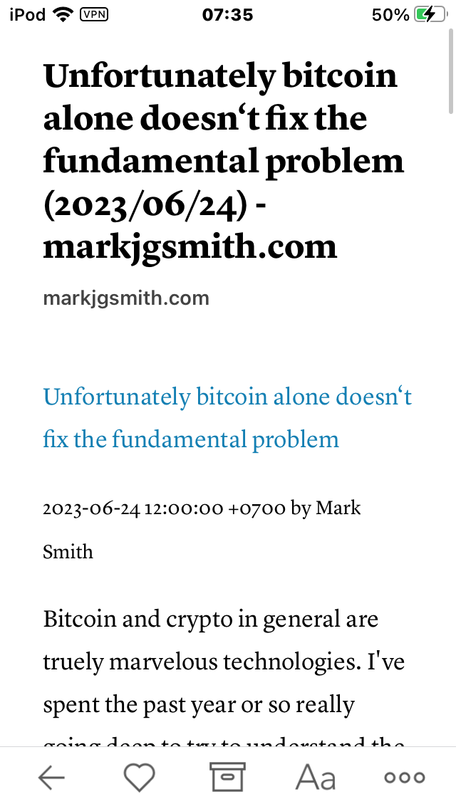
The article page for Instapaper is very similar to that of Pocket’s, though I think I prefer Pocket’s version, less wasted space. But as previously described, Pocket gets the title wrong, at least for my website.
The overall Instapaper experience is better than I remember but the following issues are still there:
- Images still missing much of the time
- Code snippets are there and readable, but look weird, no syntax highlighting
- You can’t copy and paste article titles on an article page, that’s really annoying
- When images do get saved, there is no way to zoom, so anything with detail is unreadable
This time I figured out how to ensure the Instapaper icon always appeared in the Share Sheet. That’s the box with the arrow emerging from it that you tap to share things throughout iOS. I think of it as the share button, no idea why they call it Share Sheet. Previously it was there sometimes, other times it wasn’t. I installed the bookmarklet too, very difficult installation procedure, and I found it didn’t always work. There was a 3rd way to post via email, which might be useful but it wanted access to my contacts and I’ve had bad experiences with that.
The thing that struck me was how confusing setup was. That’s what got me last time. It never felt like I got to a safe place during setup. Even after completing setup it still felt like there were two many ways to post and when it didn’t work I wasn’t sure if it was me, or the setup, or iOS config. Eventually I gave up.
I’ve been using Instapaper for a few days now, and for non-web development content it’s actually quite decent. The item download indicator is the biggest improvement over Pocket. The classier look is a big draw too. It’s nice when apps have the right vibe.
Overall though for reading web development content while offline, none of these apps are adequate. If you are relying on them to learn web development you will be at a profound disadvantage compared to being online. That’s currently a certainty.