Linkblog new look
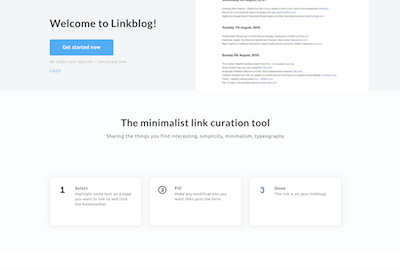
Linkblog has had a site redesign!
The redesign was actually done and released several months ago, but there were quite a few changes needed after the redesign so this is the first chance I’ve had to blog about it.
Part of what I learnt from the launch on Indie Hackers was that people really wanted a way to try out the software before committing to a subscription. So as part of the redesign I also updated the signup process so that the initial signup creates a 14 day free trial (no credit card required).


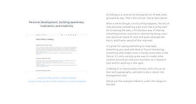
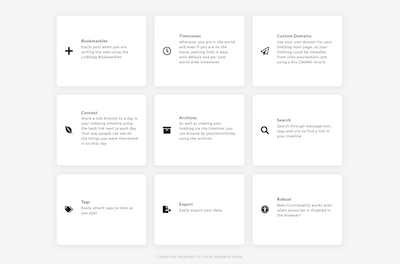
The redesign itself is based on one of the free bootstrap themes from Themes For App, I customised one of the themes to create the main landing page, signup and signin pages.

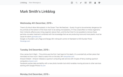
The rest of the site needed a bit of a refurbish so I decided it was a good time to upgrade the style framework I use called Bootstrap from v3 to the latest v4. I was able to get rid of some rather crufty old frontend code and replace it with new bootstrap components that use solid and modern CSS. Visually the site is a lot cleaner, the most obvious change is the toolbar along the top of the page which has changed from solid black to a lighter grey, which I think along with the other improvements in the latest Bootstrap results in a site that is nice to use and keeps with the minimalist ethos.
One big issue was that the latest Bootstrap broke the site content security policy (CSP) which ensures that only the right 3rd party libraries get loaded into the pages. There was a related CSP issue on the repo and with the help of the commenters I found a workaround to make sure that the site is still secure. According to the bootstrap devs, the CSP issues will be addressed in v5.
Little did I know that the redesign was only the beginning of a long voyage of discovery, though there wasn't a whole lot of actual movement so it's more a voyage of the mind and keyboard. I'll be following up this post with a summary of the recent major changes in the linkblog foundations.
I hope you like the new look! #